

The headline says it plainly: “Where Americans moved in 2025: A per capita perspective.”
And that last part -per capita - is the key. This isn’t just about raw population numbers. It’s about momentum: how strongly people are moving into or out of each state relative to the number of people who already live there.
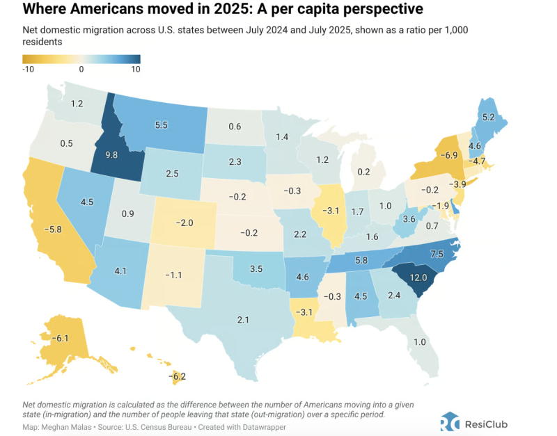
The map shows net domestic migration between July 2024 and July 2025, measured per 1,000 residents. Blue states gained people. Yellow states lost them. The darker the shade, the stronger the trend.
Here’s what stands out.
1. The Southeast Continues to Dominate
South Carolina (+12.0) leads the country by a wide margin, followed closely by North Carolina (+7.5), Tennessee (+5.8), and Georgia (+4.5).
This isn’t a one-year fluke—it’s confirmation of a longer-running shift:
Lower cost of living (relative to coastal metros)
Business-friendly tax environments
Warm weather and lifestyle appeal
Strong in-migration from retirees and remote workers
From a housing perspective, these are demand-forward markets. New construction struggles to keep pace, rental demand remains elevated, and pricing pressure—while calmer than 2021–2022—still favors sellers.
2. The Mountain West Punches Above Its Weight
Idaho (+9.8) and Montana (+5.5) stand out dramatically on a per-capita basis.
These states don’t have massive populations, but that’s exactly the point: even modest absolute inflows create outsized pressure on housing. Smaller labor markets, limited housing stock, and geographic constraints amplify the impact.
This explains why affordability challenges in places like Boise and Missoula haven’t fully eased, even with higher interest rates.
3. The Midwest Is Mixed—but Not Dead
The Midwest tells a more nuanced story:
Indiana (+1.7), Ohio (+1.0), and Michigan (+0.2) are roughly stable to modestly positive
Illinois (-3.1) continues to lose residents
Missouri (-0.3) and Iowa (-0.3) hover near flat
This isn’t a mass exodus or a renaissance—it’s selective stability. States with diversified economies and affordable metros are holding their own, while those with fiscal or population headwinds continue to leak residents.
For buyers, these remain some of the few regions where price pressure is muted and selection is reasonable.
4. The Northeast Continues to Bleed—Slowly but Consistently
New York (-6.9), New Jersey (-3.9), Massachusetts (-4.7), and Connecticut (-1.9) all show continued net out-migration.
Notably, this isn’t driven by job losses. It’s driven by cost compression:
Housing
Taxes
Insurance
Day-to-day expenses
High-earning households still live and work in these states—but many are choosing to leave once flexibility allows. That matters, because outbound migration disproportionately affects higher-priced housing segments.
5. California: Still Losing People, Just Not in a Panic
California posts a net loss of -5.8 per 1,000 residents.
That’s meaningful—but it’s also less dramatic than headlines often suggest. The takeaway isn’t collapse; it’s rebalancing. Coastal markets remain expensive, job growth has slowed, and outbound migration continues toward lower-cost states.
For housing, this means:
Softer demand at the margin
More price sensitivity
A sharper divide between prime locations and “everything else”
6. Texas and Florida: Surprisingly Moderate
Texas (+2.1) and Florida (+1.0) are both positive—but not dominant on a per-capita basis.
Why? Because they already absorbed massive population gains earlier in the cycle. When your denominator is huge, even large inflows look modest per 1,000 residents.
That doesn’t mean demand is weak—it means these markets are maturing, not exploding.
What This Means for Housing (and Why Per-Capita Matters)
Per-capita migration is one of the clearest signals of future housing pressure:
Strong positive numbers → sustained demand, tighter inventory
Strong negative numbers → softer demand, longer sell times, more negotiation
It’s not a prediction of prices next month. It’s a signal of directional force.
People vote with their feet long before the housing data fully reflects it.
Final Thought
This map doesn’t show where people dream of living—it shows where they actually moved in 2025. And the pattern is clear: affordability, lifestyle, and flexibility continue to outweigh legacy prestige.
